
From Strategy to Shades: Here is how to Shape a Brand that Resonates, Reinvents, and Reflects Culture
From trend forecasting to typography choices to the heart of our creative process, here’s how design tells stories that matter.
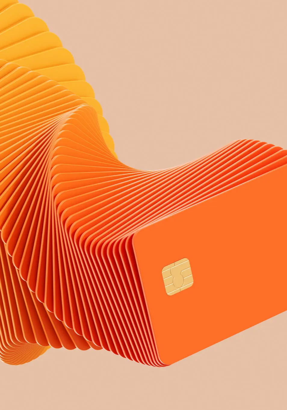
Design in 2025 is no longer just about looking good; it’s about feeling real, functioning well, and connecting deeply. The best designs are invisible and intentional. They move people. They remove friction. And above all, they say exactly what they need to say without shouting.
At our studio, we believe design should be both strategic and soulful. So today, we’re pulling back the curtain to share:
Let’s dive in.
LATEST DESIGN TRENDS IN 2025: WHAT’S SHAPING THE CREATIVE LANDSCAPE
Minimalism is still here, but it’s warmer, softer, and more relatable. Designers are combining clean layouts with hand-drawn elements, textured backgrounds, and imperfect illustrations to add personality and warmth. Think: less sterile, more soul.
AI tools are everywhere, but brands are learning that how you use AI matters. In 2025, creative teams are blending AI-generated art with human refinements, making sure the result feels real, not robotic. It’s about using tech as a tool, not a voice.
Big, beautiful type is leading the way. Designers are choosing expressive fonts that carry emotion, but only when they serve clarity. We’re seeing lots of mono-type, variable fonts, and motion typography that responds as users scroll.
Instead of choosing colors based on industry norms, brands are choosing based on emotion. Calming blues for transparency. Earthy greens for grounded brands. Deep purples for authority with a twist. It’s a mood-driven design over mechanical choices.
Tiny animations and scroll-based effects are enhancing UX without overwhelming it. Think hover states, animated buttons, subtle transitions that make the experience feel alive, especially in mobile-first design.
CHOOSING THE RIGHT TYPOGRAPHY FOR YOUR BRAND
Typography isn’t just a design element; it’s your brand’s voice in visual form.
Here’s how we approach choosing type:
Is your brand bold or delicate? Formal or playful? Contemporary or nostalgic?
Typography must match your tone. For example:
Your H1 may look beautiful on desktop, but is it still legible on mobile? We test for all screen sizes and use modular scales to ensure hierarchy stays intact.
Golden rules:
If your brand speaks to an international audience, pick a font with strong multilingual support (especially for Latin, Arabic, or Cyrillic scripts). A beautiful typeface means nothing if your message can’t be read in another language
Want to know how we go from a blank canvas to a brand that turns heads?
Here’s a glimpse into our process:
Step 1: Discovery
We don’t design without listening first. Every project starts with a deep dive: brand goals, audience insights, competitive research, and moodboarding. We ask: What should this design make people feel?
Step 2: Concept Building
Sketch, write, and imagine. This is our playground. Here, we don’t think “pretty,” we think “powerful.” Multiple directions are explored, some safe, some wild. We let the ideas speak.
Step 3: Typography & Color Curation
We build the visual identity based on tone and mood, starting with typography and color. These two elements set the emotional stage for everything else. We present options with clear explanations: why this font, why that hue.
Step 4: Prototyping & Feedback
We create mockups, scrollable designs, or previews, whatever helps the client experience the work as a user. Then we gather feedback, refine, and iterate.
Step 5: Final Touches & Delivery
We polish, prepare multiple file formats, and hand off with clear brand guidelines. But our job doesn’t end there; we often support with rollout strategy, launch graphics, and social templates too.
At its core, design is problem-solving with beauty. Its structure plus story. Intention plus
intuition.
In 2025, creativity is less about standing out and more about standing for something. Whether building a personal brand, a tech startup, or a cultural movement, design is your most powerful way to communicate, connect, and create change.
>>> So next time you’re choosing a font or sketching a logo, ask yourself:
Does this design look good, or does it feel right?
“Branding is not about being seen. It’s about being remembered.”